See This Project | Similar Projects | All Projects for Client
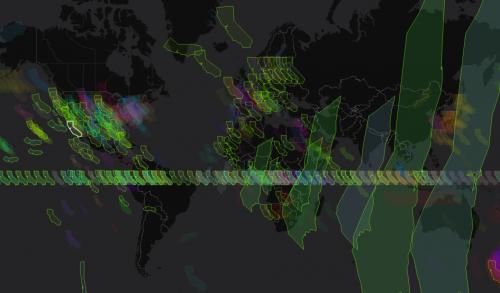
For people who use GIS, knowing the projection of a map is critical - otherwise features can show up hundreds or thousands of miles from their actual location. Most GIS data now comes with data about its projection, but sometimes it's missing or not quite clear. GreenInfo has developed a great (and fun) tool that can help solve these problems.
Projectionuesser is the result. (Its name is a portmanteau of "projection" and "guesser.") After it paints the uploaded shapefile in every possible projection, the user pans and zooms to the expected correct location, clicks on the shape, and follows the link to the .prj file (in ArcGIS, the file that describes the actual projection). The tool does the heavy lifting of considering and visualizing every projection, but the geospatial analyst is the final arbiter of which projection is actually correct.
Services: Interactive Solutions, GIS Services, Analysis, Data, Maps, Web Mapping
Tags: animation, GIS data, visualizations
Project Years: 2014