See This Project | All Projects for Client
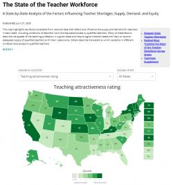
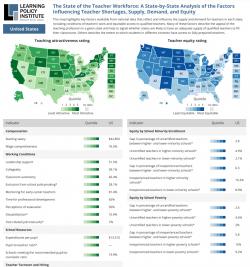
In 2016, we worked with the Learning Policy Institute to develop a clear, compelling interactive map for their major new national study on the factors that drive teacher shortages. Drawing on a range of input data, each state gets an overall rating for Teacher Attractiveness and Teacher Distribution Equity. In 2018 we updated the data and in 2023, we worked with the Learning Policy Institute to revise their infographic displaying the factors that drive teacher shortages nationwide. With updates to their research and analysis, we revised the map and tabular data display. We took the opportunity to tweak the data display and improve the clarity of the interactions between the map and metrics table below. They also brought additional contextual information, which we displayed in a table at the bottom of the page.
With a state-level map, we knew going in that success for this project would hinge on clarity of design and elegance of interaction.
Sometimes the maps we make invite the user to zoom in deeply -- to find their own houses or neighborhoods on a map. Other times, as in this case, the emphasis is on higher-level comparison and a compelling hierarchy of information. In this case, a bold, simple national map powered by High Charts pairs nicely with a clearly organized data table below. The visual through-line in the interface is a simple five-box (quintile) legend, where the active square for a selected state gets highlighted in the map legend and for each line in the table. For users quickly scanning the table, the quintile bars function almost like an old stereo equalizer, with an instantly recognizable read out of status as you scan down the table.
The interactive also includes national and state-specific PDF report downloads with the complete data, and a smaller version of the map that can be embedded in other websites. In 2023, the PDF designs were also revamped to showcase the new metrics and supporting information and documentation.
Focus: Education
Services: Interactive Solutions, Communications, Graphic Design, Web Mapping, Website Design
Project Years: 2016, 2023